Lifion Branch Management
Redesigning branch tooling for GIT
Lifion is a low code platform that enables users to build complex HR applications without the need of writing code. This product has it’s very own document management tool, similar to Stash and GitHub. From Lifion’s version of this (referred to here as ALM) users can manage their application’s branches, documents, client settings, promote products, and more.
At the beginning of 2020, our product team began discussing integrating the backend of this product with GIT’s services. This would make ALM a far more powerful application, while giving our team an opportunity to make some broad changes to the overall UX patterns of the product.
The Goals
For the Company
1. Provide the flexibility of GIT branching without slowing down the time it takes a user to develop a feature.
For me (Design)
1. Balancing the new functionality I'd be adding without overwhelming user's in the product.
The Problem
Integrating with GIT without Overcomplicating Workflow for Users
Integrating with GIT would allow our users a greater degree of flexibility with their work. However, this might make some key flows more complex, so keeping things streamlined here was a big concern of mine. The main two areas that I was focusing on with this issue were:
1. Branching - when a user creates a branch off of an existing one.
2. Merging - when a user merges said branch back into a different one.
One of the biggest challenges in adapting branching and merging for our GIT integration was how to augment the flows so these changes were clear to our users. Previously, a user could only branch off of and merge back into, master. Now, a user would be able to branch off of any branch and merge back into any branch. So extra steps and functionality would need to be added, making it difficult to keep things as simple as they were before. How could I do this without making the product less intuitive?
Solution
With all these issues in mind, I realized that I needed to strike a balance with keeping things consistent, while creating additions that were intuitive.
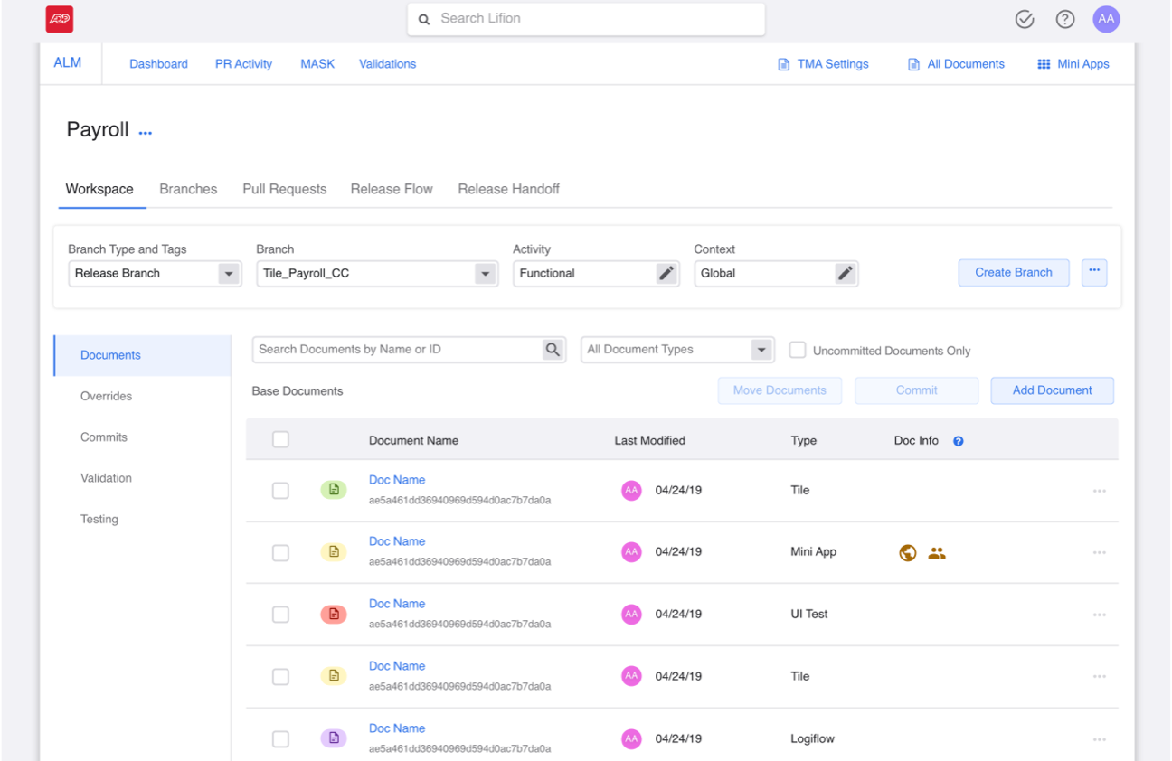
Branching - Current flow
1. User hits “Create Feature Branch” button.
Note: In this version of the product, a user can only branch off of Master.
Note: In this version of the product, a user can only branch off of Master.
1. User hits “Create Feature Branch” button.
2. User is taken to slide-in-panel where they name their branch and save changes.
2. User is taken to slide-in-panel where they name their branch and save changes.
Branching Redesigns - Ideas for User Testing and the Limits of the Platform
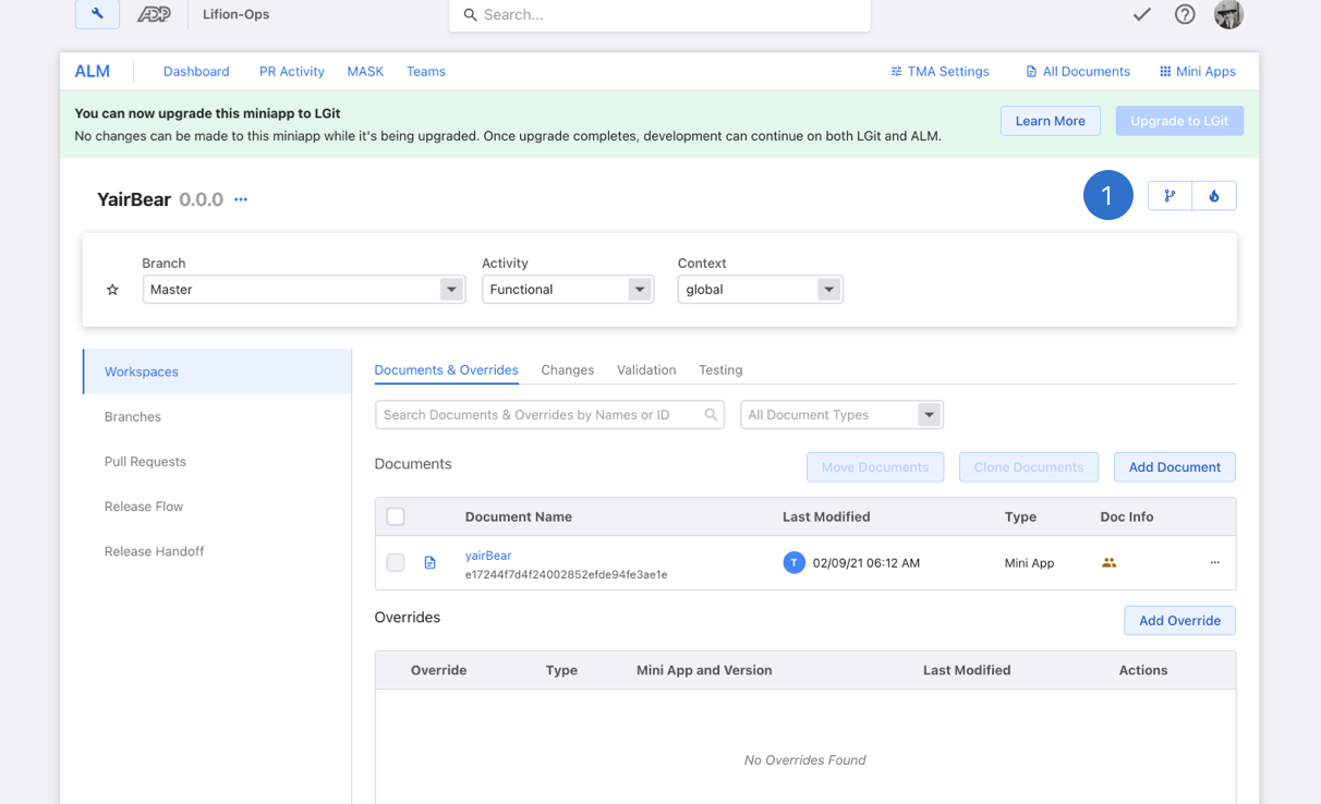
The branch bar (shown here) is where a user sets whatever branch they wish to work on. Whatever branch this piece is set to, will drive all the info shown below. I moved the branch creation to the bar (an existing element) and by doing this, whatever branch you’re set to also serves as the jumping off point for what a user branches off of.
It should be pointed out that my Product Owners and I wanted to test our hypothesis on whether this was too subtle a change from the previous work. So we flagged this for user testing and you can see that in the sections below.

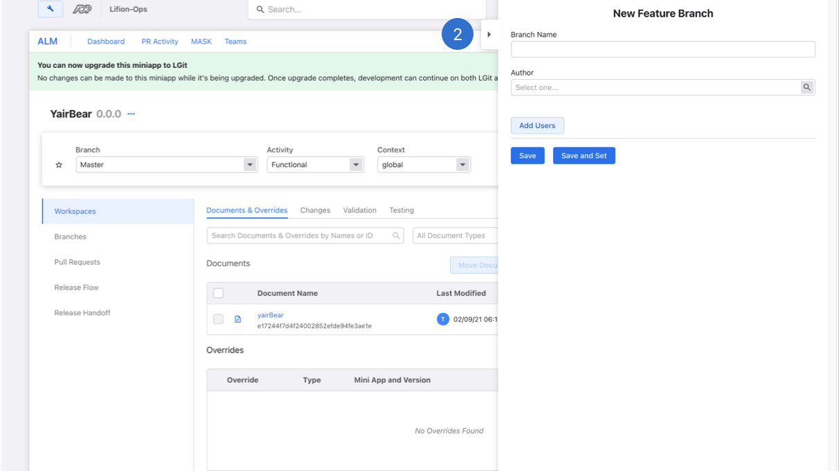
1. Since we were using the Lifion Platform Tools to build this, the development team was limited in terms of what components and operations could be used. Therefore we needed to add this dropdown shown below next to the number 1, to filter the field to the left of it.
2. The user then can hit "Create Branch" to go to the next screen (shown below).

3. The settings in the branch bar are inherited here and used automatically.
1. Since we were using the Lifion Platform Tools to build this, the development team was limited in terms of what components and operations could be used. Therefore we needed to add this dropdown shown below next to the number 1, to filter the field to the left of it.
2. The user then can hit "Create Branch" to go to the next screen (shown below).
3. The settings in the branch bar are inherited here and used automatically.
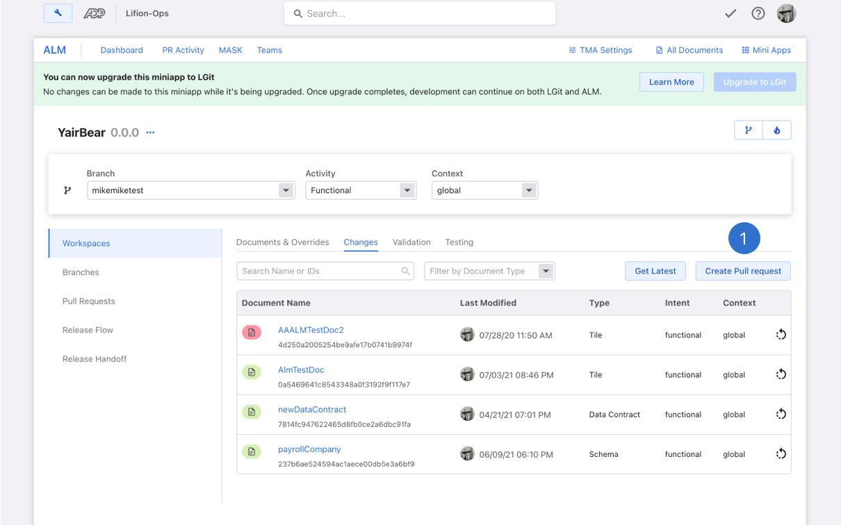
Merging - Current flow
1. In order to merge a user must navigate to the changes tab (shown here) and “Create Pull Request”.
Note: In this version of the product, a user can only merge back into Master.
Note: In this version of the product, a user can only merge back into Master.
1. In order to merge a user must navigate to the changes tab (shown here) and “Create Pull Request”.
2. The user will then be asked to name their pull request and review any differences between the branch they are merging and master in the description section.
3. The pull request will then show in the “Pull Requests” tab.

4. Receiver of Pull Request will then have to review changes and accept anything that comes in as a “merge conflict”.
2. The user will then be asked to name their pull request and review any differences between the branch they are merging and master in the description section.
3. The pull request will then show in the “Pull Requests” tab.
4. Receiver of Pull Request will then have to review changes and accept anything that comes in as a “merge conflict”.
Merging Redesigns
Previously, the merging flow was just a single modal where you chose who would review and ultimately accept, your merge request. It also was previously a single step since the system would only allow you to merge back into master and no other branch. However since we are now allowing users to merge into any branch they want, we needed to add the step of choosing the merging branch.
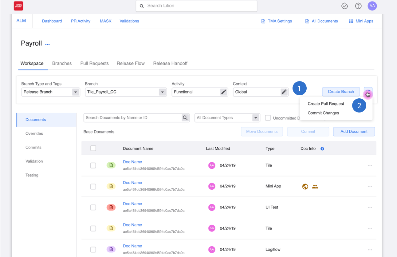
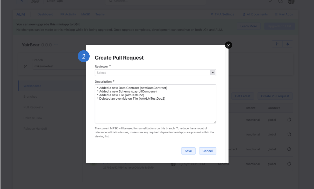
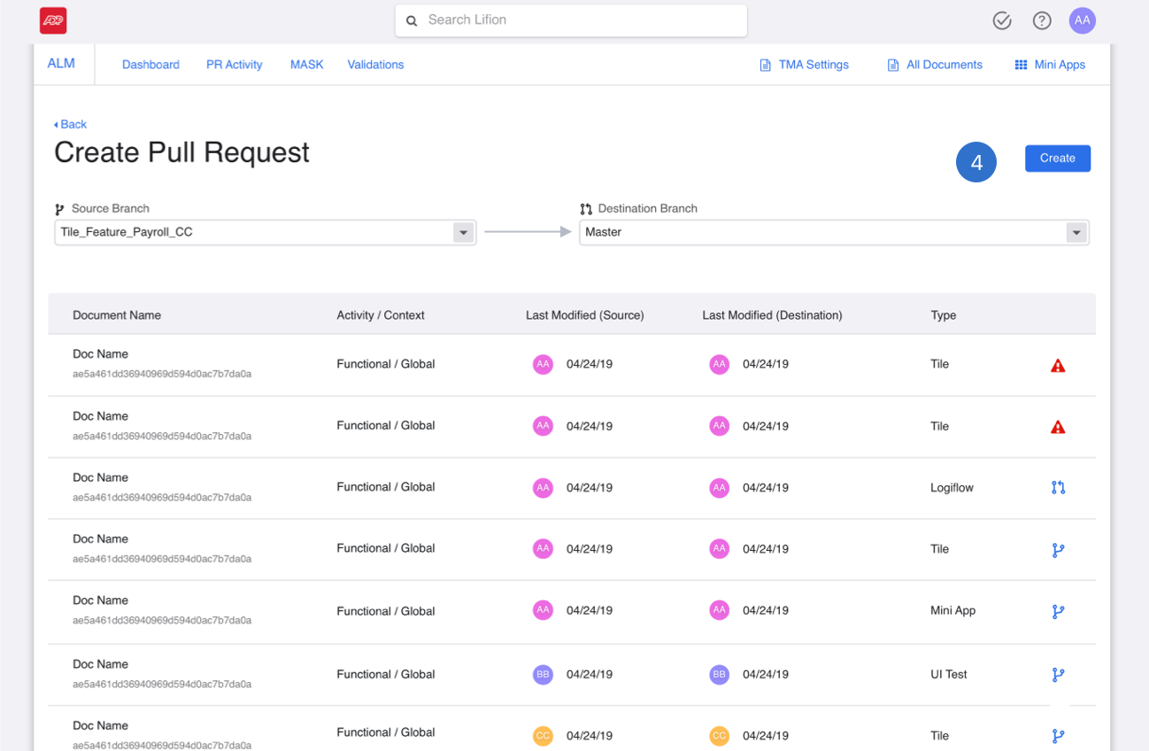
1. By moving the create pull request functionality to the branch bar, I consolidated all a user could do to a branch. Much like the branch creation flow above, the settings in the branch bar are inherited here and used automatically.
2. The user then can hit "Create Pull Request" to go to the next screen (shown below).
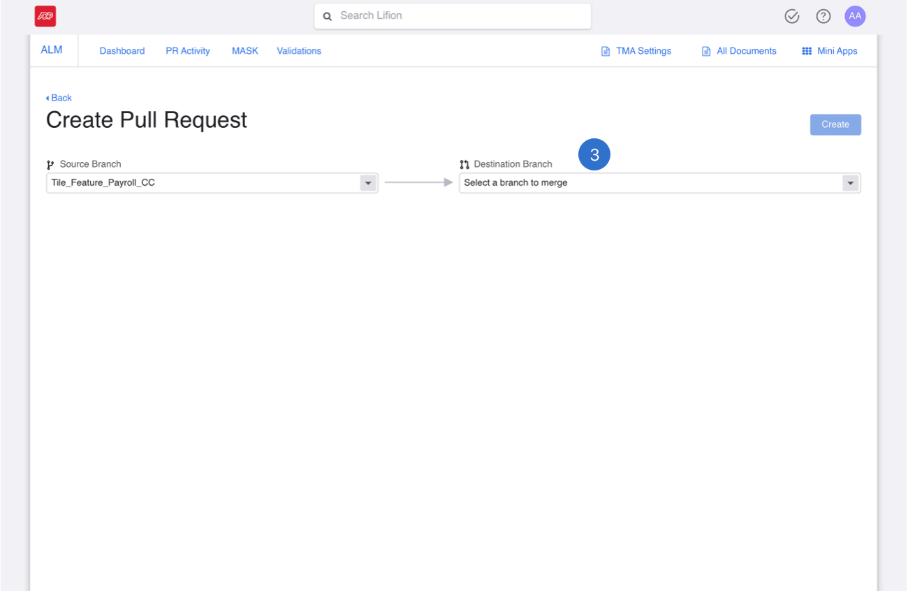
3. Once a user selects the branch they wish to merge into, a list of merge conflicts will show below.

4. When merge conflicts come up between the source and destination branches, an error icon will show up on the right end of the row.
5. When a user resolves these changes (shown below) the icon of the branch the user chose to inherit the difference from will then appear in the error icon's place.

6. This is the screen where the user gets to decide which branch to take the changes from. Due to limitations on the engineering side, we couldn't change this screen just yet.

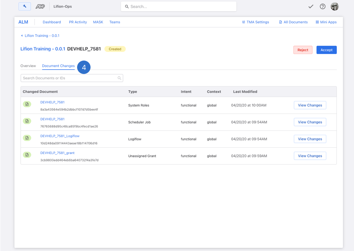
7. Once the user has repaired the merge conflicts they can then move forward by hitting “create”.
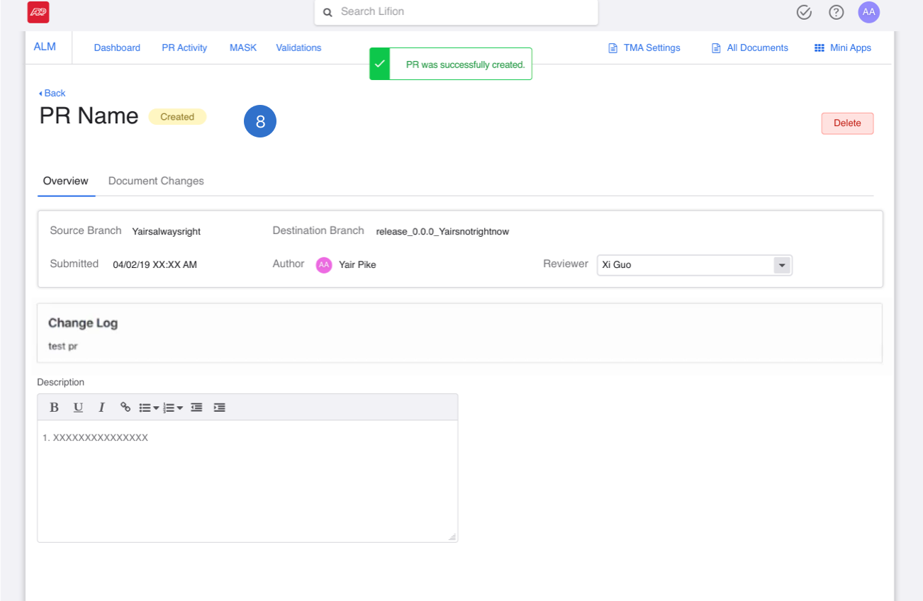
8. Once a user has created the PR, they will be taken to the PR profile page.
1. By moving the create pull request functionality to the branch bar, I consolidated all a user could do to a branch. Much like the branch creation flow above, the settings in the branch bar are inherited here and used automatically.
2. The user then can hit "Create Pull Request" to go to the next screen (shown below).
3. Once a user selects the branch they wish to merge into, a list of merge conflicts will show below.
4. When merge conflicts come up between the source and destination branches, an error icon will show up on the right end of the row.
5. When a user resolves these changes (shown below) the icon of the branch the user chose to inherit the difference from will then appear in the error icon's place.
6. This is the screen where the user gets to decide which branch to take the changes from. Due to limitations on the engineering side, we couldn't change this screen just yet.
7. Once the user has repaired the merge conflicts they can then move forward by hitting “create”.
8. Once a user has created the PR, they will be taken to the PR profile page.
Research
Since this project would affect almost all of our users, after completing this work, a recommended a round of usability testing to product. I tested with 7 LD's from a wide array of teams and experience levels to make sure our work was helpful to a variety of users.
Here's what we found:

Part of my preparation for 1:1 user interviews is to make an interview script with all my questions. I prefer spreadsheets so notes can be tracked easily across all participants.
Branching Redesign Feedback was Positive
I asked specific questions to all 7 users about this feature and all users agreed with me in terms of the branching feedback. They didn't find it confusing, in fact, they had no issues with it at all. It made sense to all the 7 users we tested with.
1. I asked users to create a new branch using the new designs and they didn't even hesitate. All found the experience to be intuitive.
2. They also commented that the "Create Branch" was the right CTA to highlight here next to the "..." dropdown with further actions.
3. Users also felt positive about the addition of the "feature/" precursor text next to their branch names for easier classification.
Merging Redesign Feedback was Not Postive
When I asked users to merge their branches back, the experience unintutive. This was due to the need to first have them create the request and then submit it as a two step process. The need for this was due to back end limitations on the engineering side, but the way I was displaying it on the front end was clearly too subtle.

1. Users found these steps to look too similar. So much so that when I asked them about the process, most were completely unaware that this was even a two step process. They didn't realize the text had changed from create to submit.

2. To address this, I redesigned the flow so that the two steps would look different from each-other. Feedback from users on this change has been that it is a better experience, but I am working with the team to recombine these into one easy step again. This will take longer due to the engineering limitations mentioned above.

3. Also, during the build process, the engineering team came up against some limitations on our platform. The branch the user chose to get the changes from couldn't be surfaced in the table. So instead of having those nice icons, we had to settle for a "view" icon instead. The user could still click in and see what the selection was, but we lost this one.
1. Users found these steps to look too similar. So much so that when I asked them about the process, most were completely unaware that this was even a two step process. They didn't realize the text had changed from create to submit.
2. To address this, I redesigned the flow so that the two steps would look different from each-other. Feedback from users on this change has been that it is a better experience, but I am working with the team to recombine these into one easy step again. This will take longer due to the engineering limitations mentioned above.
3. Also, during the build process, the engineering team came up against some limitations on our platform. The branch the user chose to get the changes from couldn't be surfaced in the table. So instead of having those nice icons, we had to settle for a "view" icon instead. The user could still click in and see what the selection was, but we lost this one.
Outcomes
1. After addressing the feedback from the user testing sessions, our product team began partnering with several teams for pilot adoption, below are some quotes from them confirming what we heard from the research and the changes we made.

2. Merging is still a pain point, but I feel like we did the best we could with the challenges my engineering team faced. They really worked with me to make that as good as it could be. Product has prioritized getting rid of the two steps in merging for next quarter. So I do think we'll get there.
3. Based on initial estimates from surveys sent to pilot adoption teams and now other teams who've just come online, productivity on most areas is up about 27%.
Takeaways
1. The product requirements for the merging section came in half way through the design process, causing me to rework a lot. This experience made me realize the importance in asking more questions to my Product Owners prior to beginning the work.
2. I also realized we should be involving engineering sooner in the process so that even if product and design miss a piece like that, they will catch it and bring it up to us.


