Developer Console Redesign
More use by changing the architecture
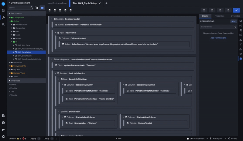
Lifion is a low code platform that enables users to build complex HR applications without the need of lines of code.
Like most other developer tools, the Lifion Developer Platform has tooling used to address errors and warnings. At Lifion we call this the Developer Console. Depending on the severity of the error, the issue may just be surfaced as a warning or may block the user from saving their changes to this document. The console is supposed to be a one stop shop for all things the system finds wrong with the work the developer is building.
The Goals
For the Company
1. During usability studies I was doing for other features, I began to notice that a majority of users were ignoring our systems error toast notifications. In fact, I began to observe that error messaging in general had been a problem. It reminded me of the Nielsen/Norman group study on how when users are bombarded with too much information repetitively, they begin to tune it all out.
For these reasons, usage of the console had dropped to about 30% of all users. Therefore the primary goal of this initiative was to increase usage to well above that threshold.
For me (Design)
1. Find ways to clarify where in build the error was occurring by giving users tools to pinpoint these locations. This would enable our users to develop faster, which would in turn decrease load time for their end users.
2. Involve both the product owner in charge of building this feature and the PO in charge of error handling to ensure consensus on the path forward.
3. Create foundational framework so that other members of my design team could plug their debug features into the console in the future.
The Problem
The Developer Console had two main problems that were learned over the years from previous research with users.
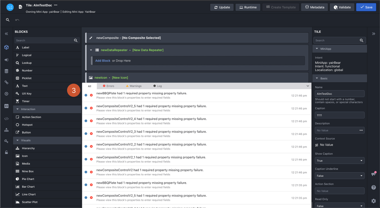
1. Errors and warnings were not grouped by component or type and since errors and warnings appear only when a user “Saves” their document, a user would usually be greeted with a barrage of toast notifications that often overwhelm.
2. Even when a user did engage with the console, there was no tooling present for identifying where the error lies within the context of the work they’ve done, making it hard for them to find and fix these issues.
3. I also knew that another designer on my team was about to start working on debugging tooling and that would need to be accessed from somewhere. The developer console seemed like the optimal place to do that, but how would we fit that in too?
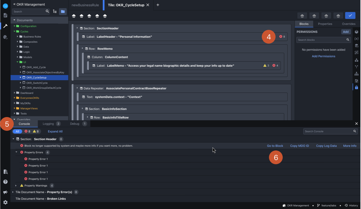
Too Many Toasts AND Nowhere to go :(
1. User hits “Save” with errors present in their work.

1. User hits “Save” with errors present in their work.
2. For each error/warning present, the user will get an individual notification, which overwhelmed users so so much!

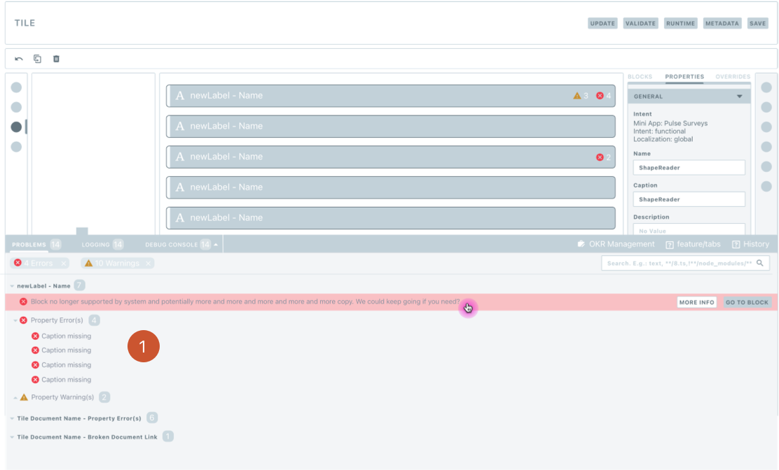
3. If the user does decide to “View in Console” they see a table with no path forward to locate the error/warning and no tooling to resolve it. This made resolving errors very time consuming.
2. For each error/warning present, the user will get an individual notification.
3. If the user does decide to “View in Console” they see a table with no path forward to locate the error/warning and no tooling to resolve it.
Solution
After noting all of the issues with the console, I did a deep-dive competitive analysis into tools such as Xcode, VS Code, and the developer tooling in Google Chrome to understand what the industry standard was.
I noted that in these other products, some level of nesting errors is usually present. Some also had functionality that either directs you to the location of the issue or lets you fix the issue right from the console itself.
Creating Error Structure
It became clear some sort of nesting needed to happen, but in order to do this we needed to categorize errors by the scale of where they occurred. So I met with my product managers and together, we came up with a set of error subtypes. Some errors would occur on a field, others on the block that contained those fields, others on the overall document. Once we all agreed on the different types, I could then begin work on how to organize and group errors together in order to reduce clutter and make them easier to track.


My product managers and I white-boarded out the the actions that trigger an error to show. As well as the levels where an error can occur.
Developer Console Redesigns
Now that we had a hierarchy, the next step was to reorganize the way errors and warnings were displayed in the console.
1. I grouped all errors and warnings in the console the same way they were grouped in the users workspace. This would make the errors and warnings easier to track.
1. I grouped all errors and warnings in the console the same way they were grouped in the users workspace. This would make the errors and warnings easier to track.
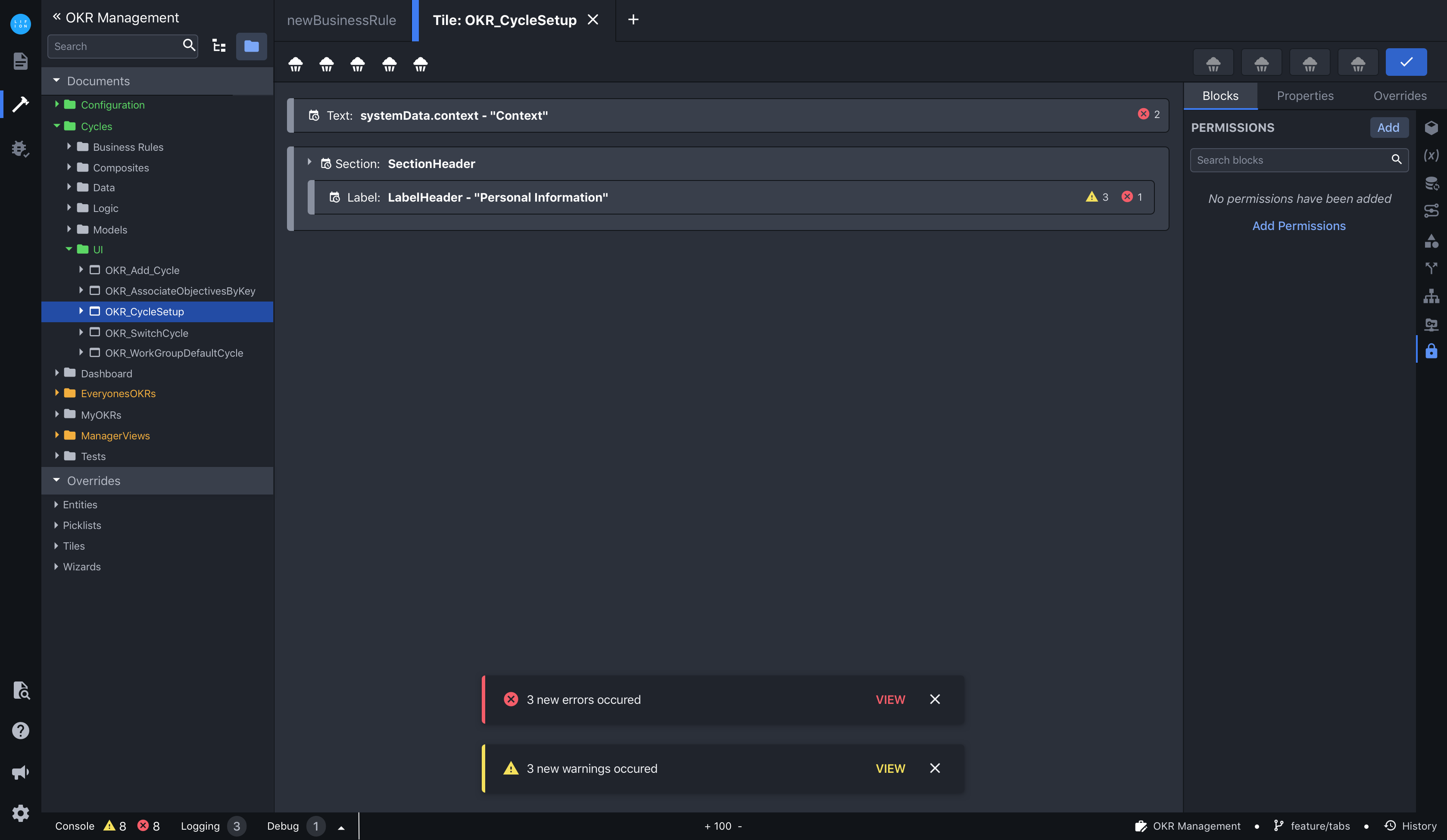
Next I needed to find change some of the UI elements to more clearly indicate overall counts of errors within nesting and on the toolbar so users could get all the information they needed without being overwhelmed.
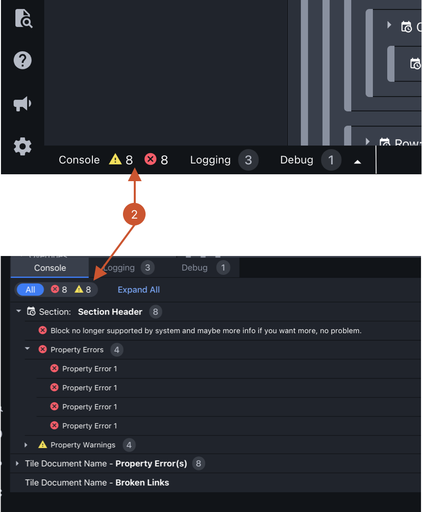
2. First option where we use icons for errors and warnings, but bubbles for all other numbers. It concerned me that users maybe confused between this difference.
2. First option where we use icons for errors and warnings, but bubbles for all other numbers. It concerned me that users maybe confused between this difference.

3. Second option, bubbles everywhere. We compensate for the lack of icons by using color. This option wouldn't work for accessibility since if you were color blind, how would you know what was a warning and what was an error? Also the color contrast was just not that readable.
3. Second option, bubbles everywhere. We compensate for the lack of icons by using color. This option wouldn't work for accessibility since if you were color blind, how would you know what was a warning and what was an error? Also the color contrast was just not that readable.
Ultimately I settled on the first option since it was more clear for users and through some hallway testing and reviews with my team, no one seemed to mind that the icons were used only in one place.
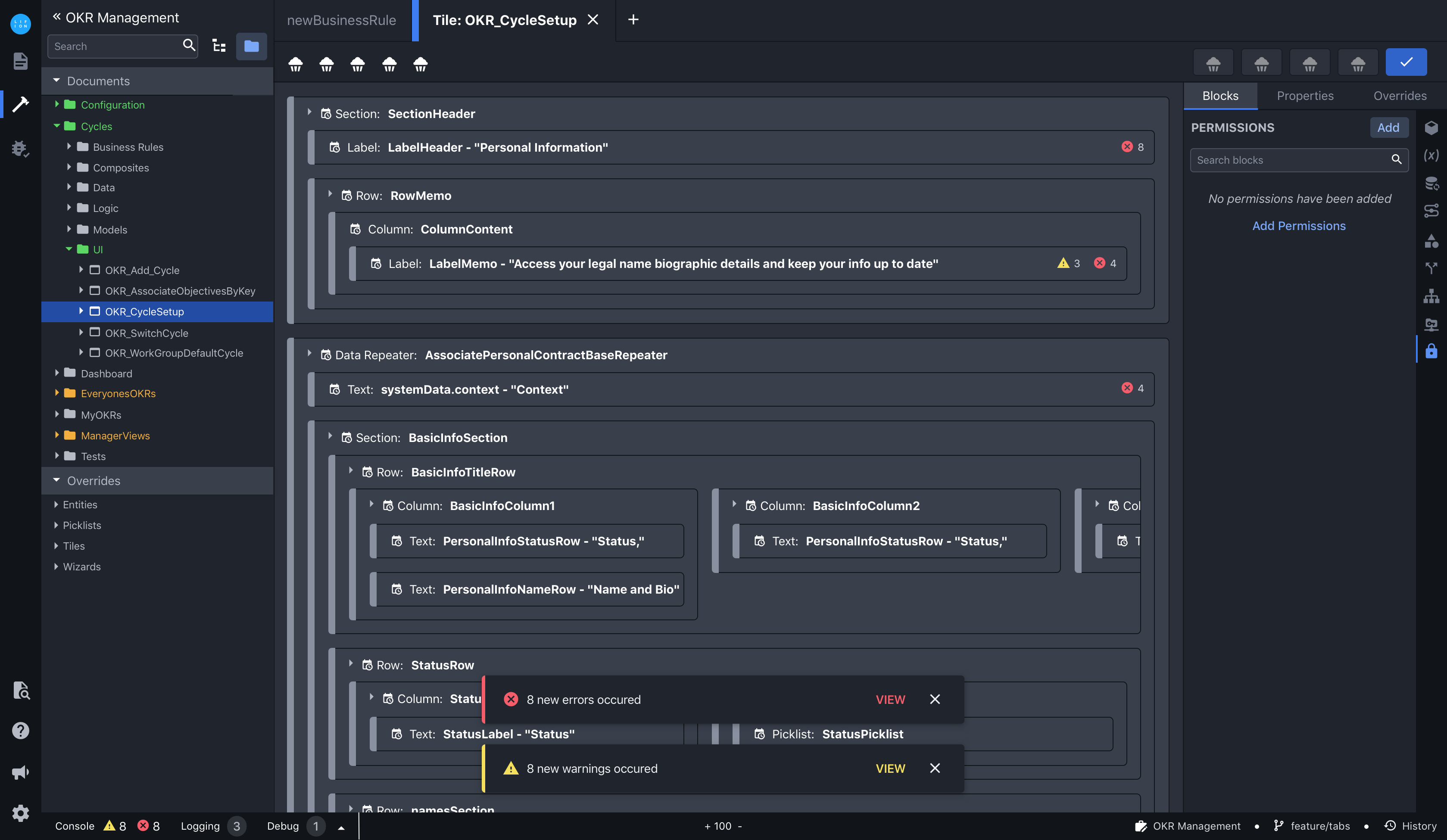
4. I put the error icons in the workspace as well, so that it would be easier to identify the problem area.
5. I created this slide/filter component and added it to our design system. It came in handy for a allowing filtering without displaying too much information.
6. I added this button so that, once clicked, the workspace would scroll to wherever the error was
4. I put the error icons in the workspace as well, so that it would be easier to identify the problem area.
5. I designed the console with a tab structure to account for my design teammates to add debugging tools in later.
6. I created this slide/filter component and added it to our design system. It came in handy for a allowing filtering without displaying too much information.
7. I added this button so that, once clicked, the workspace would scroll to wherever the error was.
Additionally, since we cannot anticipate how many blocks a user will need on any given document, the design solutions work with this. By reducing the amount of information outside the console, we are driving usage to the console. Below you can see this working with both a simple canvass and a complex one.
Errors on Simple Canvass: Few Blocks
Errors on Complex Canvass: Lots of Blocks
Finally, for the barrage of toasts. Since we cannot control the number of blocks a user might add to the workspace, grouping the toasts the way we did in the console wouldn't reduce the number the user would get. Therefore, it made more sense to group them by error type here. Again, by reducing the amount of toasts (in this case) outside the console, we'd also be driving usage to the console.

8. One notification per error type with overall count to reflect the number therein.
9. When user hits “View” they will be taken to a filtered version of the console that’s driven by the error type they hit “View” on.
8. One notification per error type with overall count to reflect the number therein.
9. When user hits “View” they will be taken to a filtered version of the console that’s driven by the error type they hit “View” on.
Outcomes
1. While this project is still currently in development due to a number of unrelated organizational changes, initial feedback has been positive. In fact, the head of the company has used it as an example of what’s possible if we work together. I think that’s in part due to how well the 2 PO’s and I partnered to solve the problem and because it’s a very digestible narrative. The current outlook is to have this finished by mid 2021.
2. Based on insights gathered during informal testing, this should increase Developer Console usage from 30% to at least 70%. We have plans to do larger usability testing and analytics once this first phase of work has been completed so we can get that number even higher.
3. My design teammates are currently factoring in the console tab structure into their work so their debugging tools can more easily be accessed from our interface. This gave my teammates a jump start, so they could spend more time focusing on design rather than restructuring things.
Takeaways
1. Though I'm very proud of the work I did on this project, it has still yet to be implemented. For future projects, I realized the importance of getting verbal commitment for project timelines, to take my work from creation to implementation.
2. During the project, I discovered that each individual product team was responsible for writing their own errors. The errors needed to fit into the framework we designed, but we had no jurisdiction over the error content. This made getting agreement from the broader community a missed opportunity here. One that I have kept in mind on future projects.