DC Provider Redesign
Bringing consistency to a fragmented flow
Lifion is a low code platform that enables users to build complex HR applications without the need of lines of code.
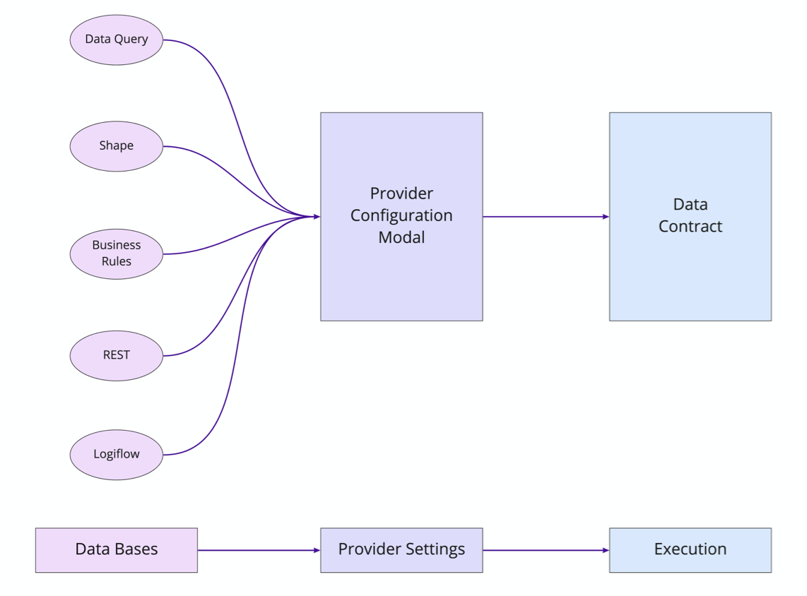
At Lifion we have a feature called “Data Contracts”. These contracts are used to link different types of database operations created in our low-code-platform. Since there are a number of operations, the contract uses a provider to tailor itself for a given operation. But that's where things get weird.
The Goals
For the Company
1. Lifion wanted to increase the speed of all products using our platform. So they were pushing teams to make this their primary method of data modeling. However teams found the experience confusing and fragmented, due to the fact that each of these individual providers were owned and build by a separate scrum team. So we needed to find a way to streamline this to increase adoption.
2. At the same time, the company was also encouraging other platform products to create new providers. Thus exacerbating the fragmented experience even further. So we needed to find a way to streamline not just the user's experience, but create a feature that was flexible for other development teams to plug into as well. This meant working in a cross functional way (no easy task).
For me (Design)
1. To do testing with users to determine the right path to address these issues.
2. Convince leadership this was worth investing in to ensure it would get built.
3. Improve usability of this feature from end to end in ways that would enable our users to develop faster, which would in turn decrease load time for their end users.
4. Find a way to work cross functionally to build consensus amongst the different teams.
The Problem
No Consistency for Both Users and Product Teams Alike
One thing that seemed clear from the outset was users had no consistency in usability patterns from one provider type to the next. For example, some providers had automated the importing of data from databases. For others, you needed to manually do this and even if a user knew this ahead of time, the steps they’d need to take to manually import the data weren't even consistent amongst the provider types where this occurs.
So if things were this inconsistent, the solution must be to create one standard flow for this whole operation, right?
Research Phase
But hold on a second here. How do I actually know this flow should be unified? I had my assumptions, but since this was a key feature for our users, I pushed my team to take a step back and do some usability research.
Met with 7 People
I found 7 users in total. Each product team uses our platform differently, so it was important to me to pick users from a wide variety of teams. At the same time, familiarity with our platform also can affect use, so I made sure the 7 covered a mixture of experience levels as well.
Part of my preparation for 1:1 user interviews is to make an interview script with all my questions. I prefer spreadsheets so notes can be tracked easily across all participants.
Quotes From Users

More Consistency
Every user told me they wanted one unified experience. They feel overwhelmed by all the tools they need to use to accomplish their work and this one isn't used every day. Therefore it would be helpful if there was more consistency across the different database types within providers.
More Automation
The users really liked the Data Query (database type) Provider experience. They appreciated the attempt to streamline and automate the flow and wanted more of it.
Easier Access to Underlying Databases
At Lifion, we sometimes refer to these databases as MDO's. The users here were asking for an easier way to access this information. Currently they need to take several steps to accomplish this.
Solution
With all these issues in mind, I went through and created one unified flow for this whole process. Below is what users said about the current state and the ways I redesigned them to address those comments.
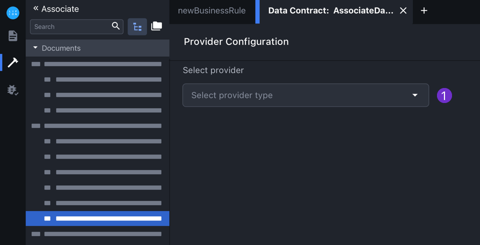
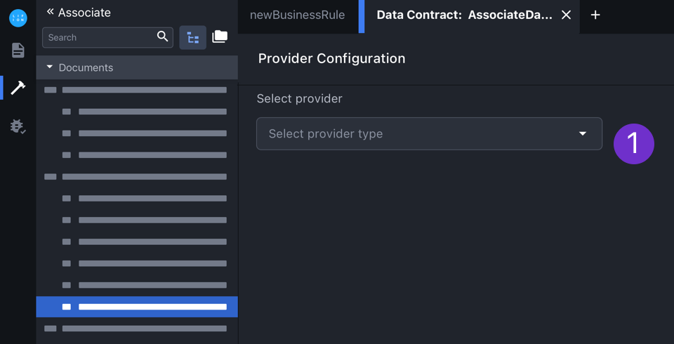
Provider Access was Unnecessary and Undiscoverable
1. Before getting to any of the modals shown above, the user must first select what database provider they want to use. And users did NOT like this. They found this modal confusing and unnecessary.

1. Before getting to any of the modals shown above, the user must first select what database provider they want to use. And users did NOT like this. They found this modal confusing and unnecessary.
2. In addition, users were constantly getting confused between "Edit.." and "Setup". One leads to the modal above, the other to the individual provider modal. Plus they told me they actually wanted MORE information exposed outside of this menu.

2. In addition, users were constantly getting confused between "Edit.." and "Setup". One leads to the modal above, the other to the individual provider modal. Plus they told me they actually wanted MORE information exposed outside of this menu.
Simplified Provider Access
One thing we learned in the testing was that accessing providers and their underlying databases was a huge pain the ass for users. Here I simplified the side menu and provided a new path to access the data for users.

1. For easier access to the provider modal, I turned the name into a link.
2. I also consolidated the options on the menu, so no one would get confused anymore.
1. For easier access to the provider modal, I turned the name into a link.
2. I also consolidated the options on the menu, so no one would get confused anymore
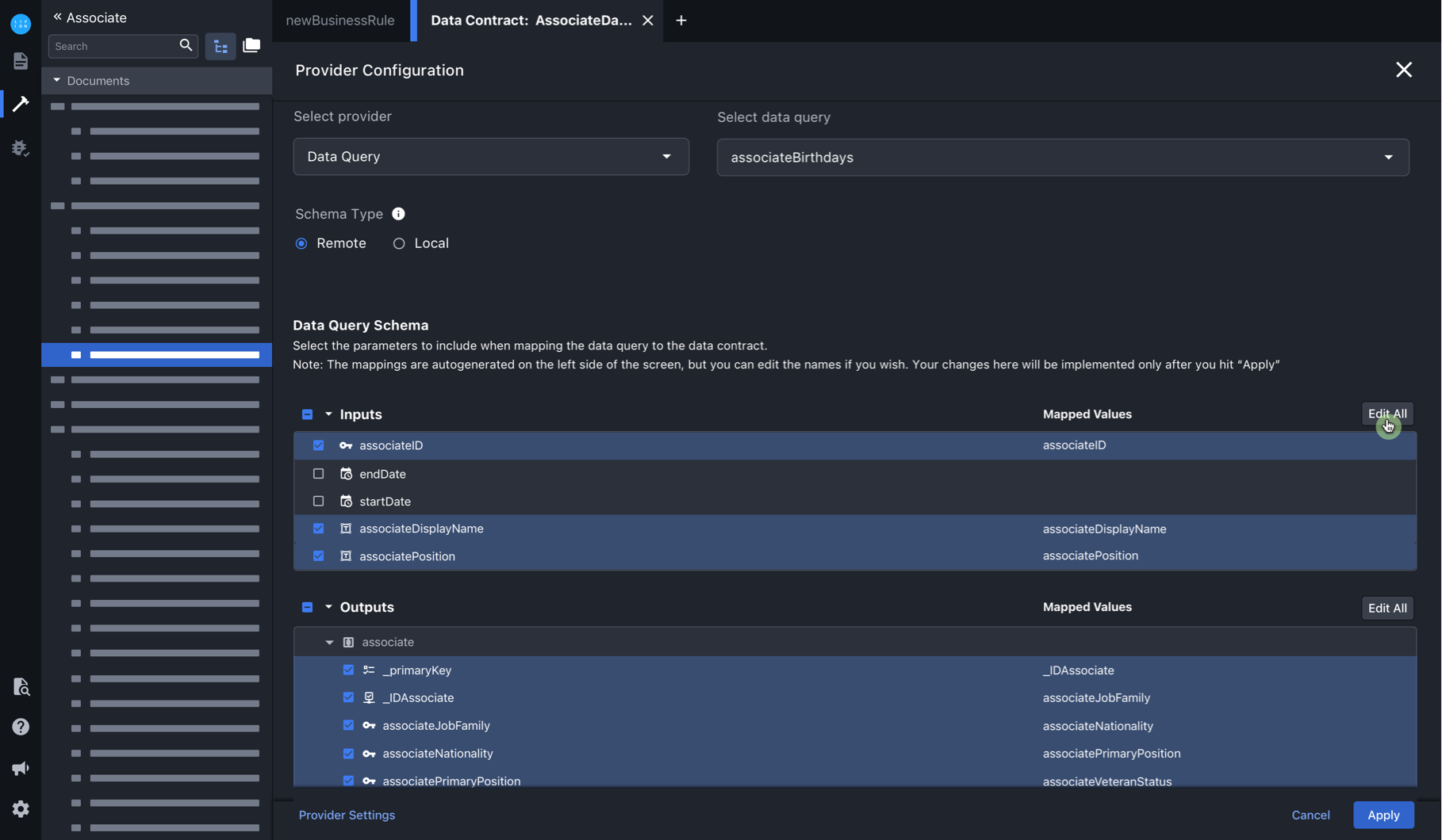
Provider w/ Data Query was well Received
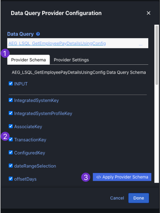
1. This database configuration was the most liked by all users. They liked its clear layout and how automated the process was.
2. Automation! Upon choosing the database the user wants, their inputs and outputs show here.
3. Automation! This button takes the information in this modal and applies it to the Data Contract.
Provider w/ Shape is SUPER FRAGMENTED
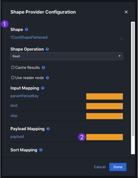
1. This database configuration (shape) was the least liked by all users. In order to set this one up, the users had to leave this modal, go to a different area of the product, set up a different process there and then come back once that was done and finish up. Essentially, no automation and a fragmented experience.
2. Also, this modal, like all others, had no product designer working on them. So we get visual patterns like these yellow blocks. They are supposed to represent missing information.
Provider Consolidation, now w/ more Automation (yay)
Now that we knew both that consolidation was needed by users AND the ways in which users moved through the process, I rethought the experience to be driven by the field selections.
Existing User Flow
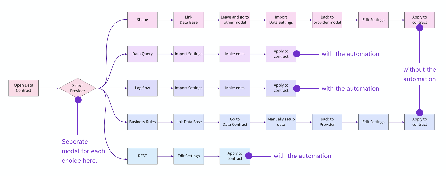
Redesigned User Flow
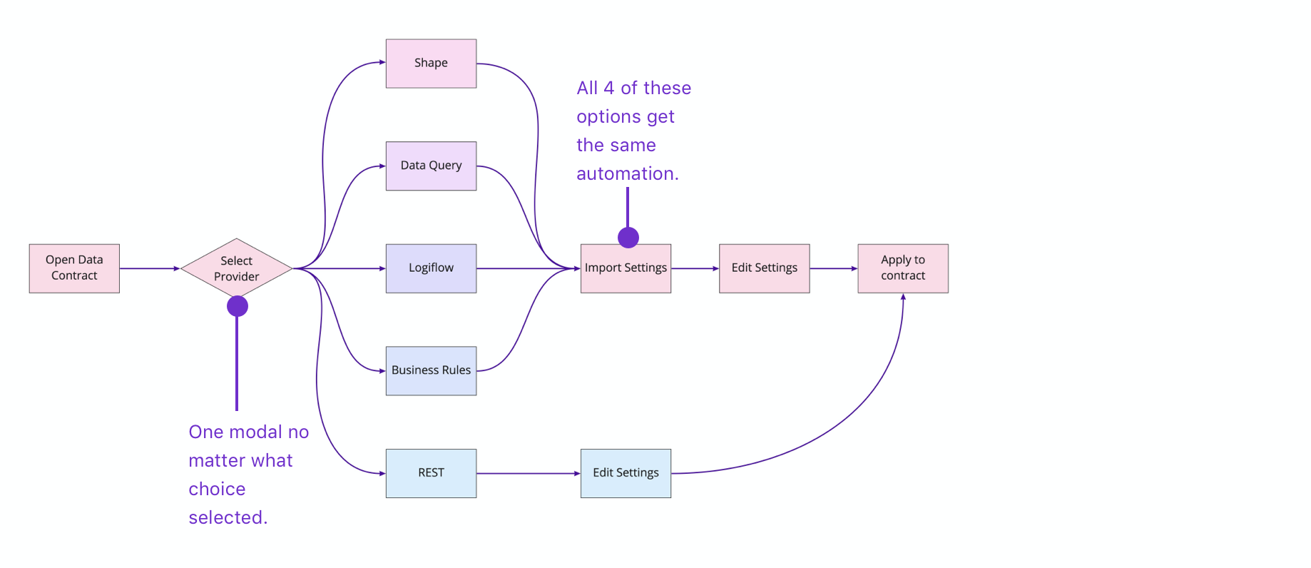
1. Depending on what provider type the user selects here, other fields relevant to that type will dynamically show thereafter.
1. Depending on what provider type the user selects here, other fields relevant to that type will dynamically show thereafter.

Additionally though there are a variety of different data base types. By upgrading to a full page modal, I was able to accommodate this spectrum.
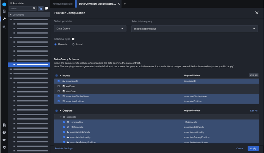
Data Base Type: Data Query
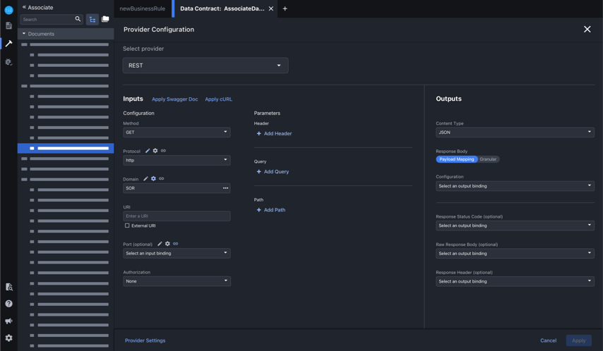
Data Base Type: REST
Redesign User Flow as shown through screens
In the following screens, the configuration options the user has is dynamically dependent on what they've selected in the previous fields. This is another way I was able to accommodate the slight variations in the different database types.
Select provider type and link document
.gif)
Edit inputs and hit apply
.gif)
Menu states and results from "apply" action
Outcomes
Research and Design = Good, Engineering Needed Tweaks
1. After completing the research phase, we were able to convince the heads of our departments to meet and review my findings. Because of the way I laid out the work and the insights found in the research, the department head were convinced we needed to not only move forward with the work, but upped the timeline and got approval to build this. They would also support us in getting approval from the other product teams who depend on this feature.
2. Based on initial very positive feedback from the users and product teams we've demoed this to, we are projecting this will decrease development time by about 30%. This product is at the center of everything developed on our platform and thus, this feature being slow and confusing to use created a bottleneck for the products developed using it. By streamlining this feature, we are in turn streamlining our product.
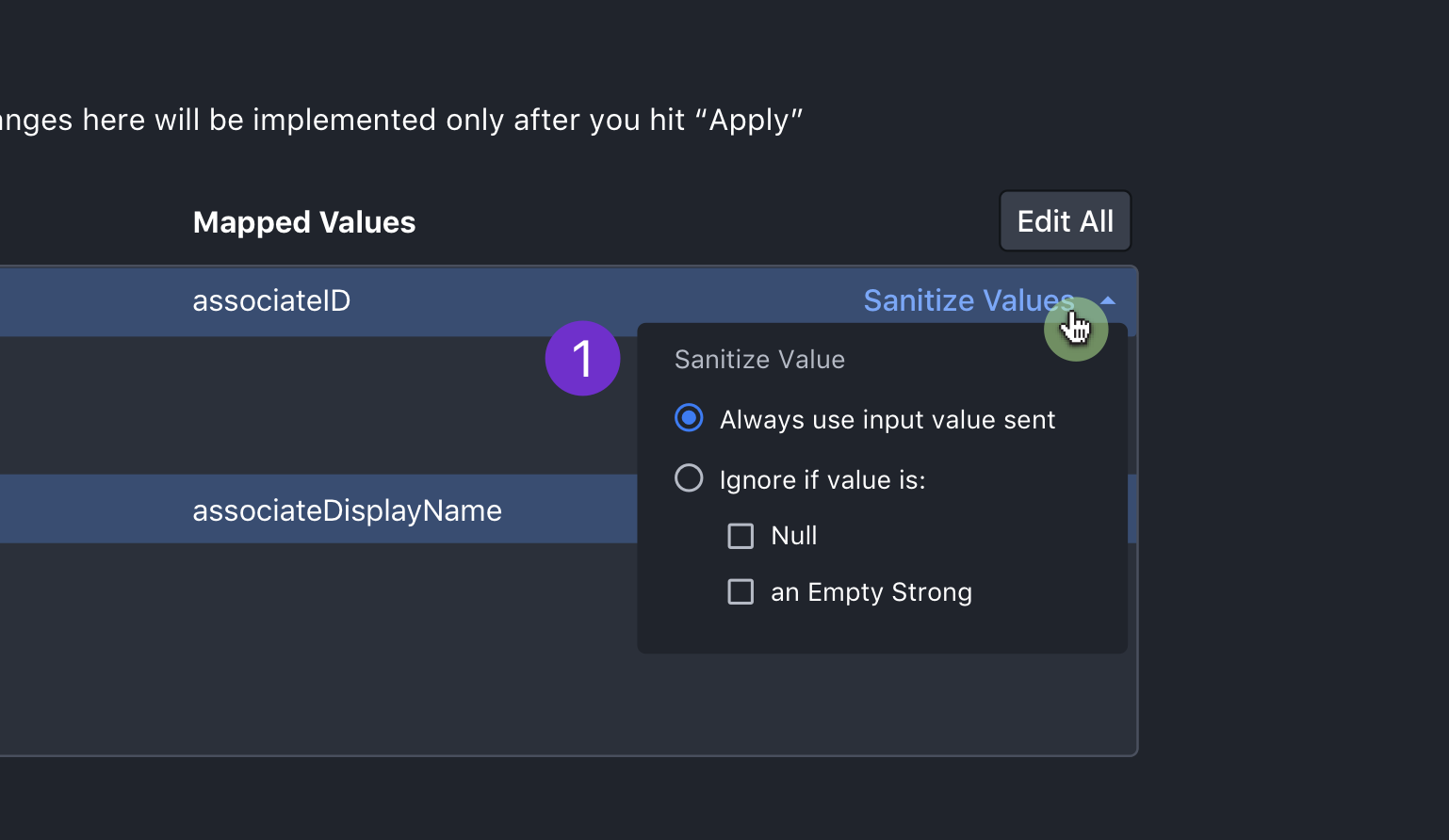
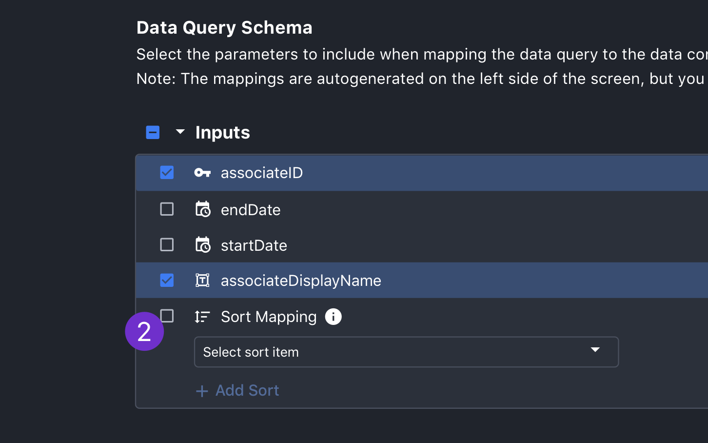
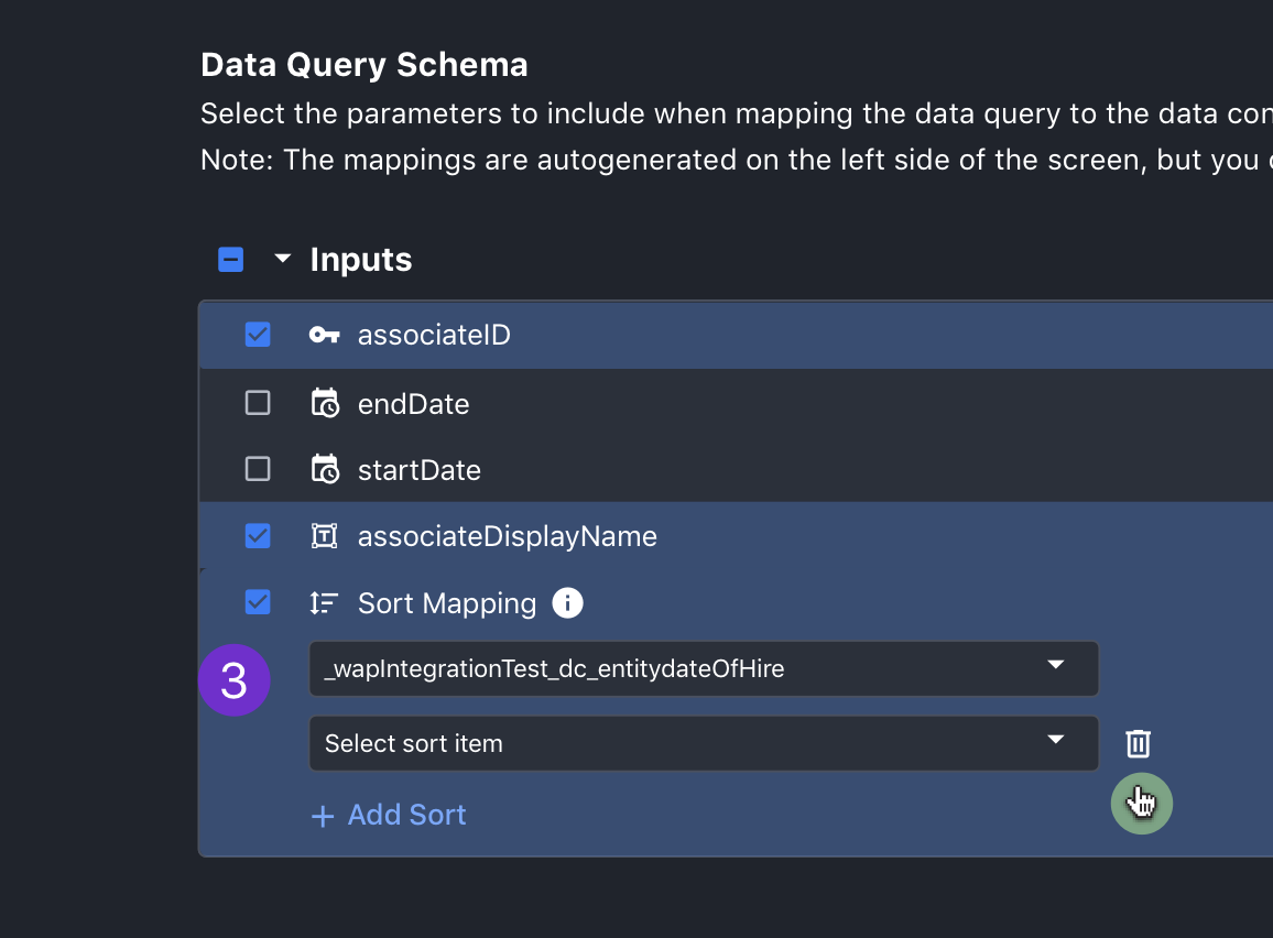
3. I'm currently meeting with the engineering team to scope this work. They have raised a number of minor issues that I've needed to make adjustments for. Two of these issues are the need for flexibility with how the Mapped Values are used once the provider is configured and allowing users to set sorting for tables. Updates addressing these issues are shown in the images below.
1. When a user mouses into the end of any row, the sanitize values CTA will appear. Upon click, the user will be able to configure under what circumstances the value will be used. This was requested by engineering to allow them to work some magic on the backend.
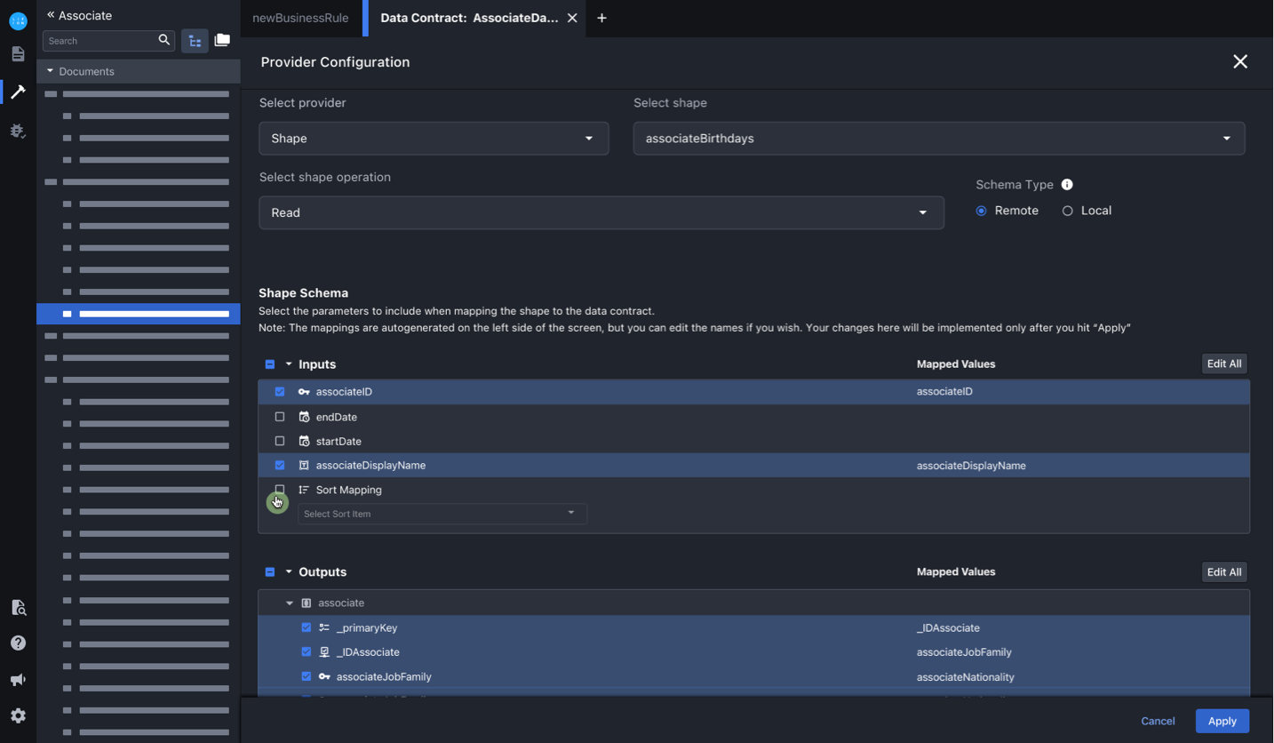
2. Another issue that came up when scoping with the dev team was sort mapping. This is for data that will eventually end up in a table and will allow users to enable sorting on columns. Since this will ultimately be derived from inputs, I added this to that section and left in unchecked by default, since it's not assumed users will always want this.
3. Once checked, the user can use the "Add Sort" button to add as many fields to sort on as they wish.
1. When a user mouses into the end of any row, the sanitize values CTA will appear. Upon click, the user will be able to configure under what circumstances the value will be used. This was requested by engineering to allow them to work some magic on the backend.
2. Another issue that came up when scoping with the dev team was sort mapping. This is for data that will eventually end up in a table and will allow users to enable sorting on columns. Since this will ultimately be derived from inputs, I added this to that section and left in unchecked by default, since it's not assumed users will always want this.
3. Once checked, the user can use the "Add Sort" button to add as many fields to sort on as they wish.
Takeaways
Involve PO's sooner and Good Job Working with Higher Ups!
1. One thing I'd learned from this process was that I needed to involve the other PO's (who owned the individual modals I was redesigning) earlier in the process. Though they are happy with the work I've done and welcome the flexibility of the designs, there were some minor features I missed initially. It would have saved everyone time if I had factored this in from the get go.
2. The other big lesson here was that when working at a big company, involving higher ups who usually don't have a lot of transparency is a great idea! Getting their buy in early and at multiple stages was very helpful. This work was fast tracked and built because of that and I will be doing more of this in the future when I can.